

This article was originally published in the Indie App Devs newsletter and written by Daniils.
In the first part of this article, I shared my paywall design tips focusing mainly on UX and visual design, but in this part, I would really like to shift focus slightly and talk about broader topics related to paywalls and app monetization in general that I have learned about when testing various solutions in my apps.
There is only one important thing I would like to mention before I continue with the tips – the same disclaimer applies to this part too – all of these tips are based solely on my learnings, experience, and testing. If your way of creating paywalls and monetizing your app is different, it is totally fine – I think there are no wrongs when it comes to that because every app is different. You can just A/B test multiple solutions you have in mind to find the ones that actually work the best in your particular situation.
Choosing Placement for Your Paywall
Placing your paywall strategically can boost conversions, but placing it incorrectly can decrease your revenue just as easily. The good thing is there are various ways of placing it and you do not have to pick just one – you can use multiple of them in your app. I have shared some of the placements you can consider for your paywall below.
On first launch
This placement might seem a bit pointless at first because you may assume users are more likely to dismiss the paywall at this moment because they have not even used your app.
In reality, users do not randomly download an app without learning more about it first. They usually go through its App Store listing – look at its screenshots, read its description and reviews, potentially even open the website of the app. This means they should already be aware of the core offering of the app and what it looks like before they even open it.
Speaking for myself, seeing a paywall on the first launch would actually make me even more excited about the app and its premium features in particular. I would definitely consider buying it, especially if there is a free trial or a reasonably priced one-time/ lifetime option – I have made so many quick purchases over time. 🙂
I have been using this placement in a few of my apps for quite some time now and it performs reasonably well, likely because I have invested effort into the App Store listings of these apps – mainly screenshots and description. With that being said, there is another placement I will talk about next that has performed even better in one of my apps, and my goal now is to give it a try in more of my apps where it makes sense.
After onboarding
Placing your paywall right after onboarding can produce the best conversion results, but it can just as easily increase your drop-off rate.
If your app requires some level of personalization, taking care of it during onboarding can make users feel more excited about it, however, this might not work well for simple or one-function apps because asking a user 10 different questions to personalize their experience for an app that only offers a handful of features can feel more annoying than exciting, to be completely honest.
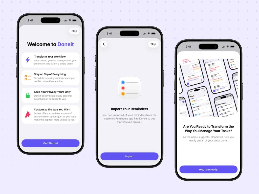
There is a solution I came up with for my app – Doneit
In between short and long onboarding – it focuses more on the value and features of the app while still having some simple but useful personalization options, such as an ability to add sample data or import reminders from Apple’s Reminders app.
Every X number of launches
The name is really self-explanatory here – you simply show your paywall after a specific number of times a user launches your app.
The idea behind this placement is to remind users about the premium offering of your app because if they keep opening it, they have already found some value in it.
I think this placement works even better if you are running a sale because users who have used your app before but have not purchased its premium version yet are now more likely to do so at a discounted price.
If you are running a sale, it is also very important to communicate it on the paywall. The best option I found is to have a banner at the top of your paywall with some details about the discount.
Every X number of times a user opens a specific screen in the app
I actually use this placement in my apps and the reason has nothing to do with conversion optimization! 🙂 Years ago when I was implementing it, I just did not know how to count app launches properly whereas counting screen opens was much easier to implement – I have not changed it since then.
My advice if you decide to go with this option is to allow for more opens of a screen before showing your paywall because I once tried showing it after as few as 2 opens resulting in a negative review.
The key lesson I learned is that optimizing your conversion is good, but offering a great user experience in your app is even better. I eventually changed it to 5-10 opens for a much better balance giving users enough time to actually use the app.
In settings
It is probably the easiest placement of all because all you have to do is add a section in the settings of your app with a button that opens your paywall allowing users to learn more about the premium offering of your app or simply ignore this section if they are not interested.
The only suggestion I have here is not to rely on this as your only paywall placement because most users do not open settings with an intention to make a purchase – this should be treated as a backup option for users who have already decided to buy the premium version of your app because this can be an easy way for them to find it.
After interacting with a premium feature
Instead of fully locking a premium feature or showing an error alert when a user tries to interact with it, you can consider showing a paywall screen at that exact moment.
One caveat I would like to bring up here is that you need to make your premium features as clear as you can upfront. There is probably nothing that can put users off more than thinking a feature is free and then seeing a paywall when they tap on it. In my apps I simply use a lock icon or a disabled button/ picker with a short message and a CTA explaining that it is a part of the premium version of the app. It is a small thing to do, but it improves the UX of your app in a meaningful way.
How to Run Sales
In my experience, this is one of the best strategies to get a nice increase in revenue for a short period of time. If your app does not have high operating costs, occasionally offering a discount on some or all of its premium options can really increase overall revenue.
My main piece of advice here is to avoid running sales too frequently because I learned this the hard way. I used to run sales very rarely, and every time I did, the revenue would increase quite a bit, which made me believe running them more often would be beneficial for my app business. I was wrong! The more sales I ran, the less of an impact each of them had on the revenue – sometimes there was almost no difference at all.
Benefits of Hybrid Monetization Model
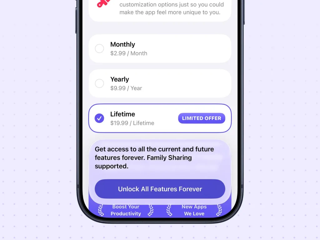
Suggesting a specific monetization model for your app is very difficult because there are a lot of factors at play that I am just not aware of, such as your advertising spend, cost of running your app, and more, but there is a monetization model that may actually work well for your app. At least it did for mine. Why, you might ask? Because it is flexible. It is called the hybrid monetization model.
I noticed it has become even more popular recently, but I have been using it for over 5 years now for most of my apps.
A simple definition of the hybrid monetization model that I can give is using multiple monetization models at once. Are you including ads in the free version of your app with a one-time purchase option to remove them? That is hybrid monetization because you are using both ads, one way of monetizing your app, and a one-time purchase, which is another way to generate revenue from your app, at once.
It really worked well for my apps because more than 60% of the revenue that they have generated over the years has come from one-time/ lifetime purchases – the revenue that my apps would not have otherwise generated with a subscription-only model.
Paywall Is Not Everything
I know the title of this section sounds quite strange in a two-part article focused entirely on paywall design tips, but a paywall is just one of many tools you can use when running your app business – it is definitely not the only one, and there are even situations where it may not help at all.
For example, if your app does not get any downloads, a well-designed paywall is not going to improve its revenue in a meaningful way unless it has a lot of users who have not purchased the premium version yet.
Fully Customizable Paywall for Your App
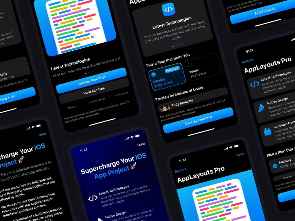
I have designed and built various paywall templates as part of my AppLayouts project that you can use to effortlessly highlight the premium offering of your app. They are available for both iOS and macOS in Figma and SwiftUI. There is also a 50% Spring sale available right now.
I really appreciate the time you have taken to read my paywall design tips, and more importantly, I hope you found them useful!
If you’d like to get a comprehensive audit of your paywall, need a custom paywall designed specifically for your app, or have any questions about paywall design or anything else app-related, feel free to get in touch with me via email.
I am always happy to help!
Want to learn more? 👇
Check AppLayouts website and follow on X/Twitter!
