

This article was originally published in the Indie App Devs newsletter and written by Daniils.
I still remember the first time I designed a proper paywall for my app Doneit back in early 2021 and how much I have actually enjoyed this entire process.
Since then, I have designed a few dozen paywall screens for my apps and various templates for my AppLayouts project, mostly using Apple’s native style with a bit of custom touch – this is literally how I call my app design style to be fair. I have also defined a playbook with an extensive library of different paywall components both in Figma and SwiftUI that I try to follow and use when designing and testing my paywalls – this has proven really useful to me and it’s always such a time saver.
I can confidently say that paywall design has turned into quite a passion of mine over the years and I was very excited when this opportunity to write my paywall design tips for Indie App Devs came up.
Before I get into the tips themselves, I just want to give a disclaimer that all of them are based purely on my own learnings, experience, and testing. It’s totally fine if your way of creating paywalls is different – I truly believe that there is no wrongs when it comes to paywalls as you can always test your solutions to see how they perform to find what works the best in your particular context.
Feature-Based vs Value-Based
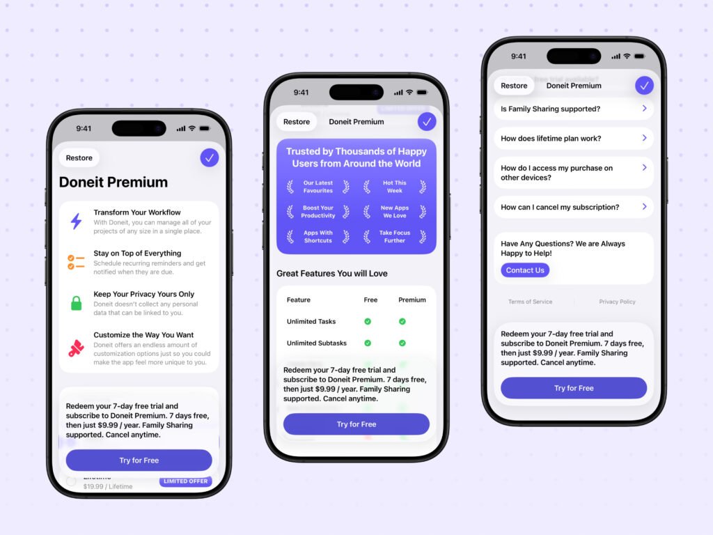
I used to think the sole purpose of a paywall is to list features that users would get access to after purchasing the premium version of the app, which I now call a feature-based paywall. But what is a value-based paywall, you may ask? It’s quite an interesting concept that I discovered a while ago and there is a simple example I always like to use to explain it.
If you are working on a habit tracking app with unlimited habits being a premium feature, you would usually highlight “Unlimited Habits” as the key feature on your paywall, but can you, for a moment, think as the user of this app and what you would be looking for specifically. Unlimited habits? Yes, but is there a reason why? Also yes! Most probably because you would like to build various routines that last.
So instead of using “Unlimited Habits”, you would use “Build Lasting Routines with Unlimited Habits” as the primary feature of the paywall in your app because it now highlights value that users will get from your app, not just a feature itself, making it more relatable to them which can potentially increase a chance of them purchasing the premium version.
Copy Matters, Especially for CTAs
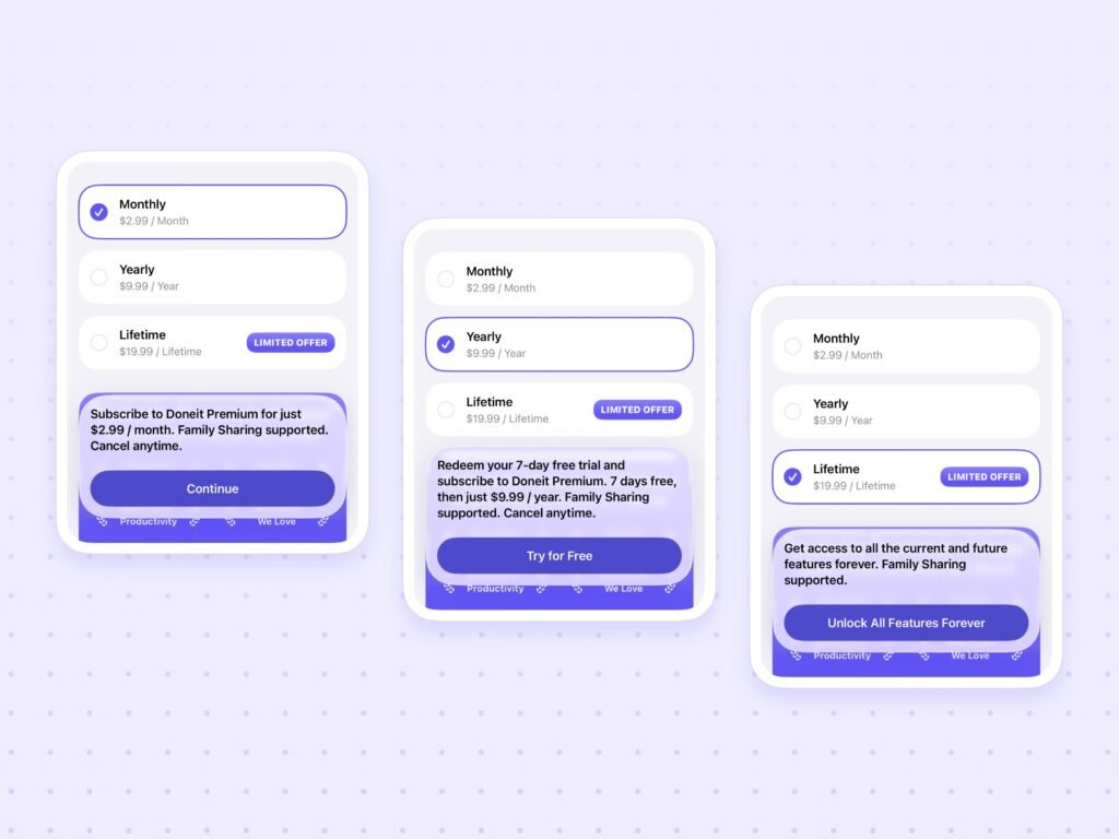
Building upon what I have already mentioned above, copywriting is really an important part of the paywall design process. I believe that a great copy alone can significantly improve the performance of your paywall. Being honest here, I didn’t value copywriting that much in the beginning, but I have learnt the power of it through various articles and videos I found online. I will now share an easy-to-understand example, as well as a small exercise, that can help you fully understand this concept too.
Let’s assume you offer a subscription in your app with a free trial. In this case, your CTA would normally be “Start a Free Trial” or something very similar. Does this work? Yes, of course, but is there a better option? Definitely, and I will share it in just a moment!
I would now like to ask you to do a very small exercise – just think of a time when you recently had to start something you weren’t too sure about. How did you feel? Did you want to start it right away or did you procrastinate and delay the decision until later? Probably, at least I did, and I feel the same concept applies to paywalls. If your CTA leads with “Start”, it can feel like a big commitment to make, like you have to actually start something, especially if users aren’t fully sure if they would like to use your app or another one – they would simply postpone this decision until later, but if you use verbs like “Try” (“Try for Free”) or “Redeem” (“Redeem Your Free Trial”), it’s more likely to feel effortless making the decision of starting a free trial and actually trying your app easier to make for users, which would then allow them to explore everything your app has to offer to understand its value in full, and continue using it and stay subscribed to your app.
The other aspect I would like to talk about is the use of all caps for titles of CTAs – while there is nothing wrong with it in a broader context, I think using it for CTAs isn’t the best option – let me explain. The reason here is actually pretty straightforward – all caps usually make text feel louder and harder to read. Would you like the most important buttons on your paywall to come off as such? Probably not, but if you would still like to use all caps for your CTAs, what you can do is increase letter spacing which improves legibility.
Utility Screen Effect
I am honestly not sure if anyone has used this term before in a context of paywall design (I apologize in advance if this term was already defined before), but I have come up with it to describe certain types of paywalls, and I think it’s really important to understand the idea behind it.
One of the main purposes of a paywall is to excite users about the app and highlight how much value its premium offering can actually bring to them, but if your paywall is just a few lines of text and a CTA (Over-exaggerating here a bit), in my opinion, users are more likely to just dismiss it when it appears, without even exploring it further, because it looks like a simple utility screen, such as settings that users would only go to if they actually need to.
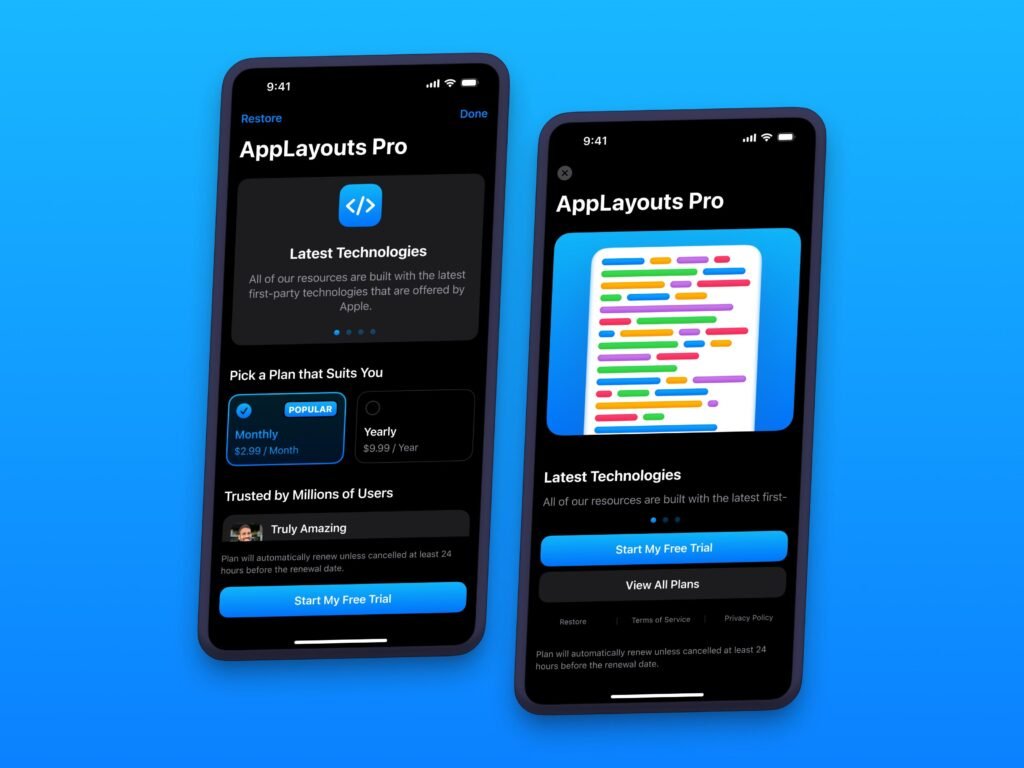
My advice to overcome this effect is to design a paywall with engaging content, such as features list or pagination, comparison table, pricing section, timeline for a free trial if applicable, social proof, and more, as well as use compelling imagery and/ or iconography. The main idea here is to make users feel excited and curious about the premium offering of your app to promote further exploration of the paywall screen, increasing the time users spend on it, which can then, in theory, lead to a higher chance of conversion.
Please just don’t get me wrong here, if your app is at $10,000 MRR and growing, but your paywall falls under this effect, it doesn’t mean that you need to change it – not at all, but if things aren’t working as well as you would like, this is definitely something to consider.
As with every tip in this article, this is based only on my own experience – there was a noticeable increase in trial-start rate and lifetime purchases when I changed paywalls across my apps to a longer scroll ones with more content.
My Playbook for Higher Converting Layout
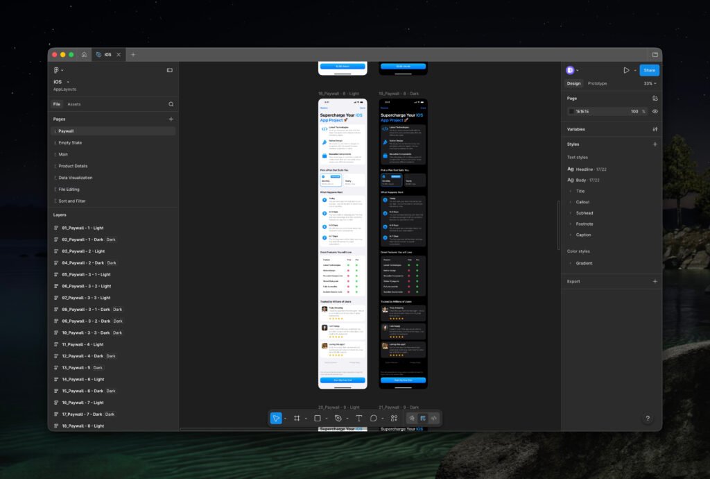
Have you ever thought of sections ordering on your paywall? Probably not as much, if not at all, but does it even matter? In my opinion, yes and it matters a lot – I will explain shortly.
I didn’t pay as much attention to structure of my paywalls earlier – I simply placed content in a way I liked, but over time, I have developed a robust structure that I now try to follow, with quite a bit of flexibility of course, for paywalls across my apps because I realized one thing – intentionality in structure and ordering of sections on a paywall screen can help a lot with building trust and confidence in the app for users making that purchase decision easier to make if the app clearly communicates the value it provides to users.
The first section I often place on my paywalls is a list of value-based features. It simply highlights the value the app provides to users – usually 3-5 features with an icon, title, and description for more context. The key here is to keep everything concise and benefit-focused rather than listing features your app has to offer with detailed explanations.
The pricing section usually goes second in my playbook – the purpose of this section is to display all premium options of your app, and more importantly, highlight the most obvious one that you would like users to choose – this can be done in multiple ways – by making its design more prominent, including a badge (For example, “50% Off” or “Limited Offer”), or simply pre-selecting it by default. I would just recommend limiting the number of plans you display in this section to 3 because the more options you offer at once, the harder it is for users to make a choice, which then creates a decision fatigue leading to a higher drop-off rate (Users simply closing the paywall).
There is another section I frequently include, which may not work for some apps, but I quite like it – it’s called features comparison table. This section is really great if you would like to mention the actual features of your app without being too value-focused. The name here is really self-explanatory, you simply compare features across free and premium versions of your app to showcase key differences and additional functionalities that users would get access to by purchasing the premium version of your app. There are a few reasons why it may not work for some apps. Primarily, if your app offers a generous free plan, the users would then have no need to purchase the premium one at all leading to a reduction in conversion rate.
Additionally, if your app only has a handful of premium features, it may put users off because it would come off as quite underwhelming making the premium offering of the app feel insufficient rather than useful and exciting.
Social proof and FAQ sections are essential parts of any paywall too – though you don’t have to overcomplicate them at all. Has your app ever been featured by Apple? If yes, then mention it. Do you offer a subscription? If yes, just add an FAQ item explaining how to cancel it. Does your app support Apple’s Family Sharing feature? If it does, here is another FAQ item you can add. You should also include a section with legal links, such as privacy and terms, an option to restore previously made purchases, as well as a way to contact you in case if users have any questions.
The last but definitely not least component that goes on my paywalls is bottom toolbar/ footer, and I think it’s quite an important one. The main idea here is to keep its content as simple as possible and make it be fixed at the bottom of the screen so as the users scroll, key details about pricing plan and CTA are always present. I usually include something along the lines of “Redeem your 7-day free trial and subscribe to Doneit Premium. 7 days free, then only $9.99 / year. Family Sharing supported. Cancel anytime.” or similar based on the pricing plan that is currently selected by the user and whether or not I am currently running a sale, as well as a CTA whose title also adjusts based on the selected pricing plan.
This is where various paywall components and templates from AppLayouts really shine – I know I am quite biased here given it’s my project, but you can use any other paywall design library you like, or even build your own. The key here is to have various base components ready that you can then effortlessly customize for multiple paywalls and A/B tests you might want to run eventually saving you a considerable amount of time. Just to give you an example, I recently had to design a paywall for an app with a very custom and gorgeous design – quite different to Apple’s native style I am personally very used to. I initially thought it would take a while to design it, but actually, after ideating on solutions and then jumping into Figma, adjusting my paywall components to the visual language of this app was a breeze and I have managed to design it reasonably quickly.
Perfect Paywall Just Doesn’t Exist
I have said this before and I will say this again! There is no such thing as a perfect paywall – what works for one app might not work at all for the other, but what you can do to find a paywall that works well for your app is just test various ideas and solutions. You can now use AI for this too – simply ask it to generate paywall and A/B test ideas to increase specific metric, such as conversion or trial-start rates, analyze them, and pick and test the ones you think are the most promising.
I usually run simple A/B tests for at least a few weeks to test potential solutions, whilst frequently looking at my App Store Connect and RevenueCat dashboards to oversee the overall performance.
I honestly don’t have a fancy setup for my paywalls and A/B tests – if there is something interesting I want to test, I just make a change in Xcode, release a new update with this change on the App Store, and then look at dashboards to understand the performance – it’s just as simple as that. This might not be as efficient or scalable to be completely fair, but it works well for my small app business and the only thing I would like to change at some point is to switch to remotely configurable paywalls, such as what RevenueCat (I currently use it for in-app purchases and subscriptions in my apps) or Superwall offer, to optimize this whole process even further.
One other important aspect I would like to highlight here is that you should keep A/B testing very focused – I try to avoid testing more than 1-2 changes at once because then it becomes much harder to distinguish which solution actually worked and which didn’t.
Paywall Audits
I am currently working on a few interesting projects for AppLayouts, one of them being a paywall audit service.
The idea behind this service is not to offer a call with me to discuss your paywall, although if you would like to have one, we can definitely schedule it too, but the unique aspect here is that I will provide you with a presentation (At least 3-5 slides) highlighting various suggestions and improvements that you can make in your specific paywall, as well as a few potential design options you can consider that I will share with you as a Figma file.
This project isn’t official yet and I haven’t fully finalized the pricing, but I am planning to price it at $299 initially. If you are interested and would like to be one of the very first customers, or if you have any questions, I would love to hear from you – just get in touch with me via email here!
By the way, I also offer a $100 discount to the first 5 customers making it just $199!
I just want to say thank you so much for taking your time to read all of these tips and I really hope they will help you when you will be working on paywalls for your apps!
Want to learn more? 👇
Check AppLayouts website and follow on X/Twitter!
